Mobile.First
INFORMATION ARCHITECT
Matthew Mondzelewski
Services
Information Architecture
UX/UI Design
Mobile First Design
Functional Specs
Usability Research
Adobe CMS
SAP.com
Date
2011 – 2014
Team
SAP N.A. Marketing
SAP Global Communications
TekSystems
Richard Moore
Engineer the most efficient site architecture? Think again. Because SAP.com changed all the rules of the game:

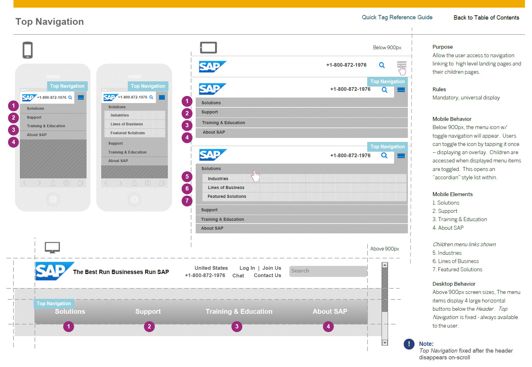
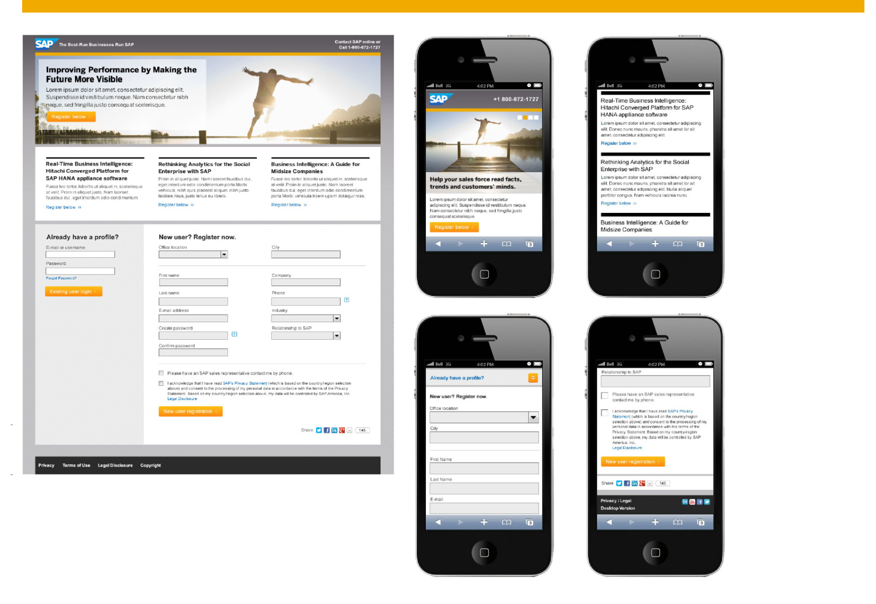
Mobile First CMS Component Design
Here, SAP.com is laying the foundation for product marketing zones which operate as their own mini sites. Sure, owners will have to color inside the lines and play inside the templates, but they will also get a clean, contemporary look and feel, plus control over their media, content, and message.
Although SAP.com’s design is revolutionary and has some fantastic upsides, this approach isn’t for the faint of heart. You need at least four things to pull this off—and none of them are optional.
The first two will be easy. The third? Not so much.
1. Full buy-in from your boss, your boss’s boss, and stakeholders.
2. Execute centralized, iron-clad governance. A gulag mentality will probably work best.
3. Constantly monitor for rogue behaviors that quickly clobber the user experience. (This is easier when you invest in #4.)
4. Invest in a CMS system. If you don’t, you’ll go blind trying to chase stakeholders around.

Result.
SITEIQ VIEW | When you really examine the nuts and bolts of the new SAP.com site, you’ll see that it isn’t doing anything that we haven’t seen before. What sets it apart is that it’s taken a set of great ideas—and then reworked them to best effect. Used them on a grander scale. Pushed them a little farther. Packaged them a little differently. In the end, that’s what it takes to create a unique user experience — and a best in class Website.
siteiq.net
