BukitTravel
Design
Matthew Mondzelewski
Services
Client
Clarivate Analytics
Purpose
Empowering travelers to dream, plan, and explore.
Building the foundations of a travel app
Bukit is a foundational design concept for users to manage a personal bucket list for travel. A digital experience to plan trips, gain insights on destinations, book travel (flights, hotels, tours, and transportation), receive personalized recommendations based on their preferences, and interact with other community members.
42% of global travel bookings were made via web app an additional 10% on mobile web
The travel app industry had a market size of $629B in 2023 which was a 13% increase from 2022. Domestic travel is expected to grow by 3% annually reaching 19 billion lodging nights per year by 2030! International travel is also projected to ramp up to its historical average of 9 billion nights.
According to McKinsey& Co., the state of tourism and hospitality could reach full recovery in 2024. The thing is, the bulk of travel spending is done close to home. Domestic travel represents the largest market share, which is 75 percent of global travel spending. In the next five to six years (2030) that number is expected to be 70 percent.
We already know planning a trip is personal.
It’s complexity depends on the traveler, and the length will vary depending on certain factors like cultural norms, work schedules and geographical factors. Domestic trips often range from a weekend getaway to a week long vacation. International trips vary widely from short city breaks, to extended journeys lasting several weeks, or months. Business trips are typically shorter and last a few days. For Bukit users, we wanted to appeal to the adventurous travel market who are essentially a part of the new 5% willing to spend on their “bucket list.”
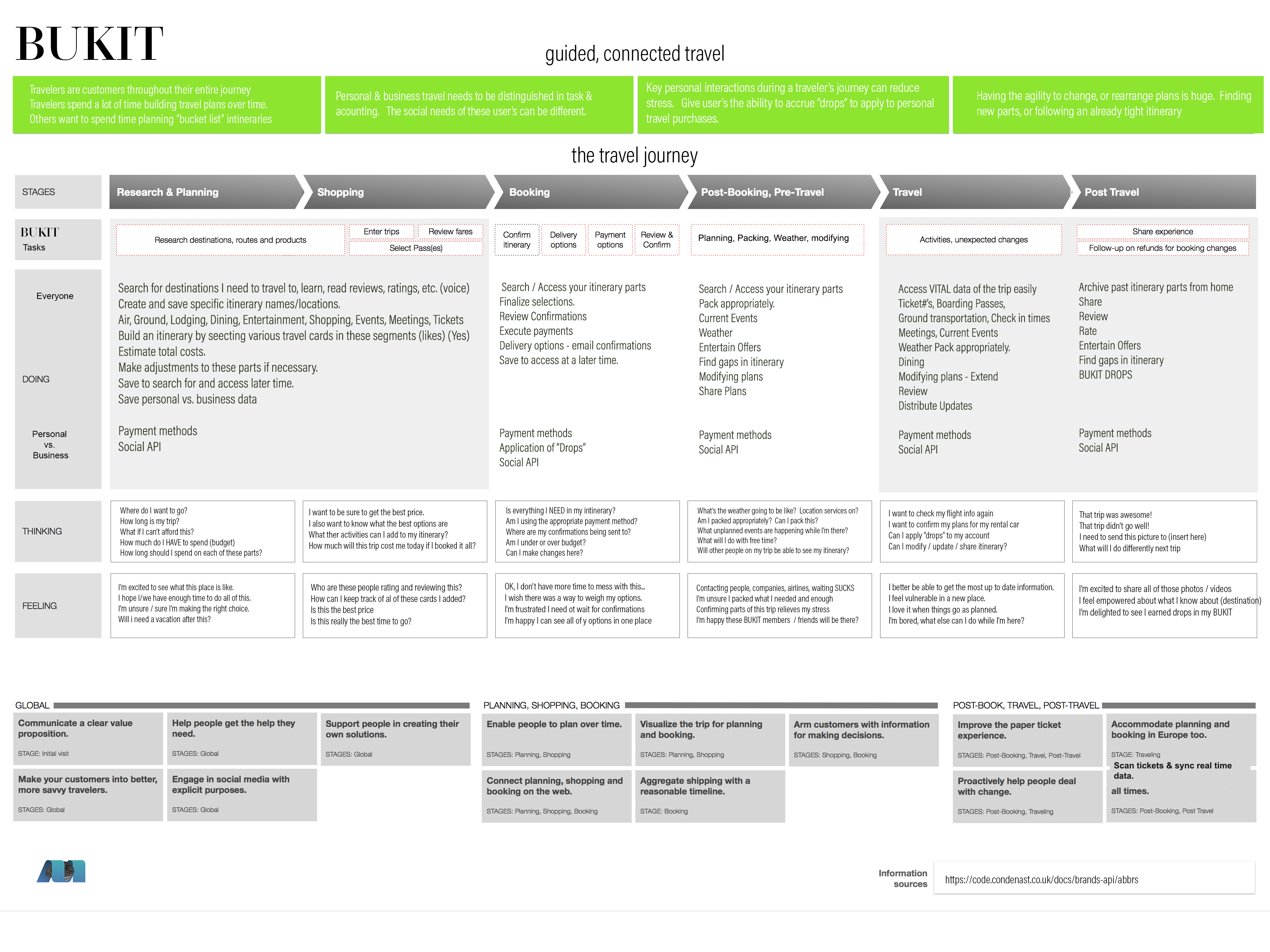
The journey map explores the user’s journey in six stages, from research and planning to post travel. Each stage is broken down into tasks based on behavior. When asked about these stages of travel, participants helped connect these tasks to thoughts, feelings and sentiments which helped shape the design process.

This sentiment is ultimately where the opportunities present themselves to connect in meaningful ways with the customers.
Matthew Mondzelewski
Mobile first design, for mobile users.
61% of travelers in the US have booked and paid for travel with their smartphones within the past year. 64% use their smartphone en route to their destination. This increasing reliance on mobile devices during travel highlights the importance of travel apps and mobile-friendly service for today’s travelers. When it was time to design screens, it was important to understand the priority of device design and scale it to accomodate other users. I considered these 6 design principles:
- Clean UI and straightforward navigation
- MVP design focused on essential features and tasks
- Clear Calls to Action
- Concise, Impactful Messages
- High-quality images of destinations to inspire users.
- Visual storytelling through user-generated content.
- Tailored recommendations based on user preferences.
- Customizable bucket lists and itineraries.
- Live weather forecasts and flight status.
- Notifications for booking confirmations and reminders.
- Invite friends to join trips and share plans.
- Collaborate on bucket list ideas.
- Integration of Social, Travel, and Dining API’s
- Safeguard user data and protect personal information.
Result.
Bukit aims to be more than just a travel app—it’s a companion that fuels wanderlust, fosters connections, and turns dreams into unforgettable memories. Dream big, plan smart, and explore the world with Bukit.
